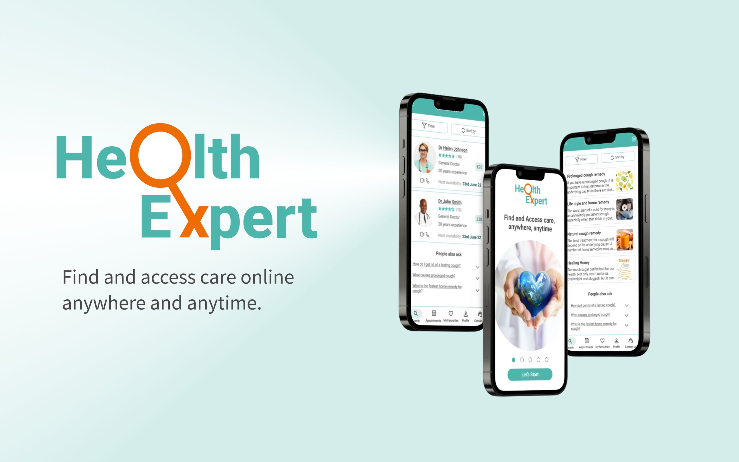

Overview
The goal of this app is to give people a simple, intuitive way to connect with a Health expert in nearly any speciality within seconds so they can feel more informed and more prepared to face their everyday (and not-so-everyday) problems.
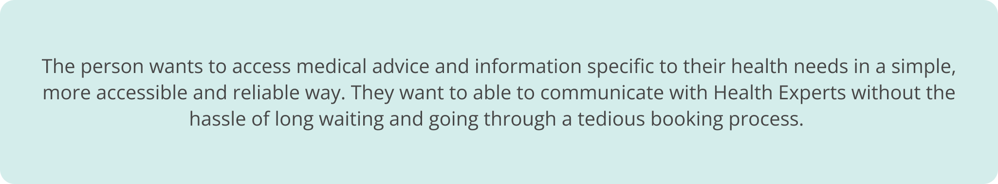
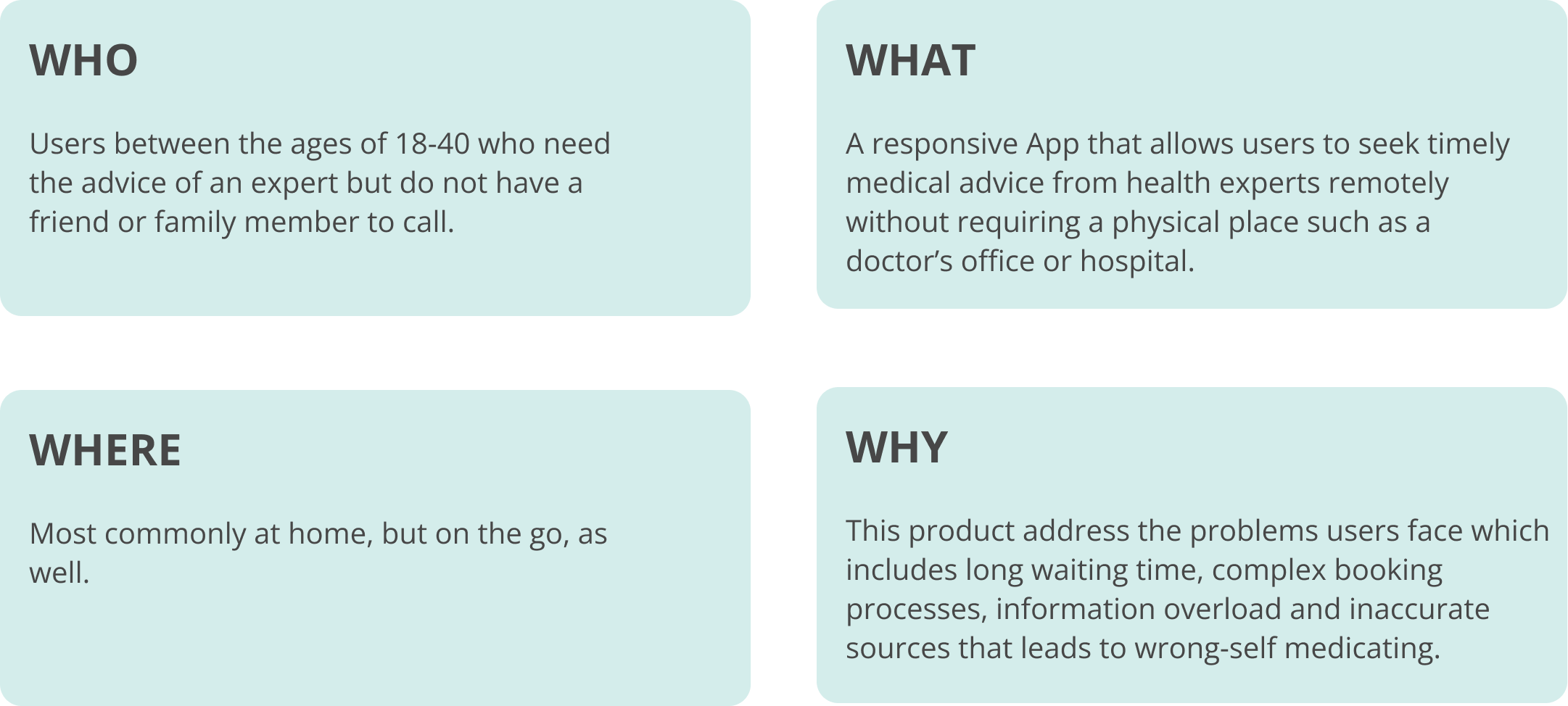
The Problem Statement
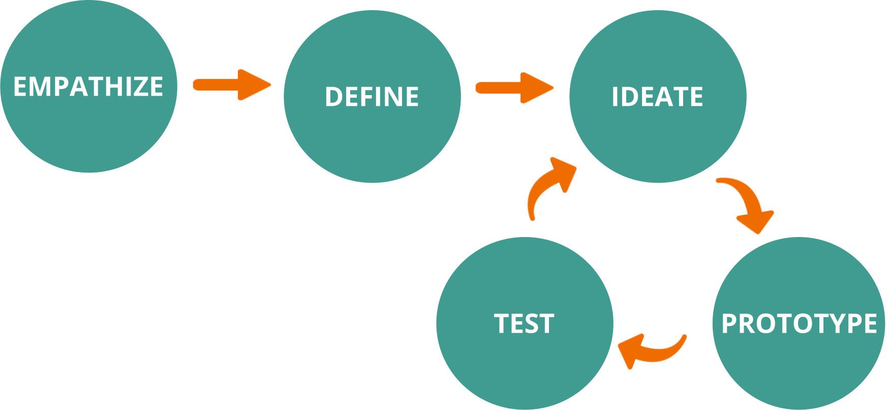
My Design Process
-
I gained an empathetic understanding of the problem I am trying to solve through researching my user’s needs.
-
I stated the user’s needs and problems from information gathered during the Empathize stage.
View page
-
In this stage, I challenged assumptions and created ideas to solve the problem stated.
View page
-
Here, I identified the best possible solution for each problem found.
View solution
View presentation & figma
-
Here, I tested the prototype with users. Then used the results to redefine one or more further problems. Hence an iterative process.
View page

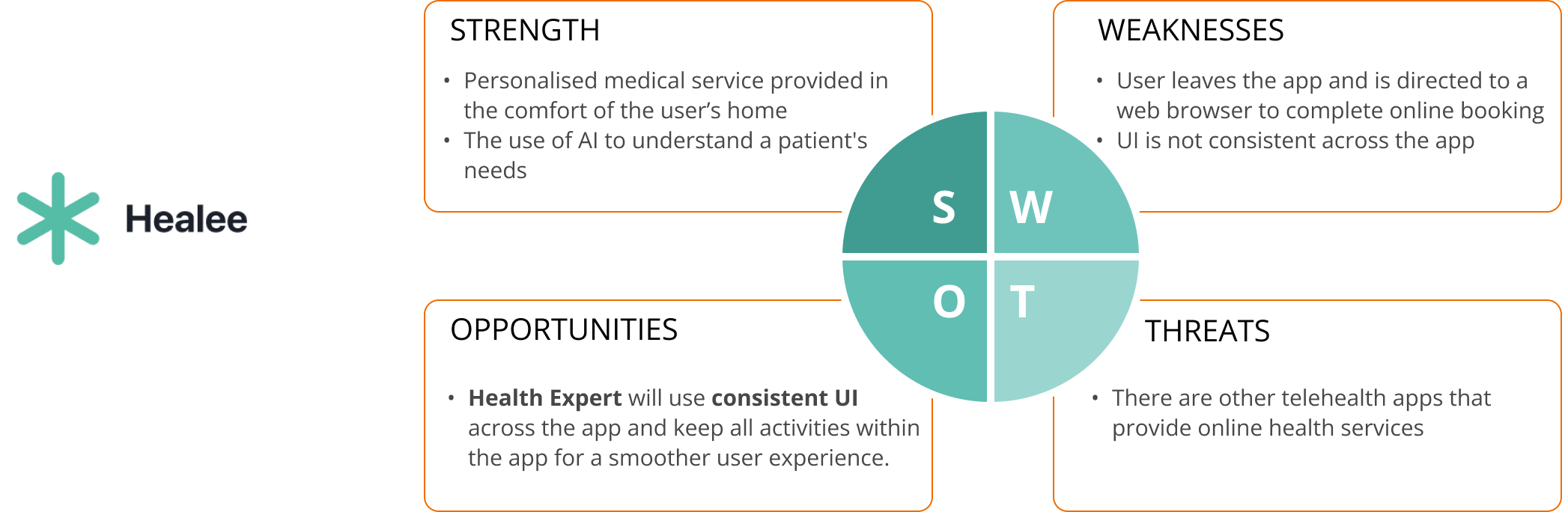
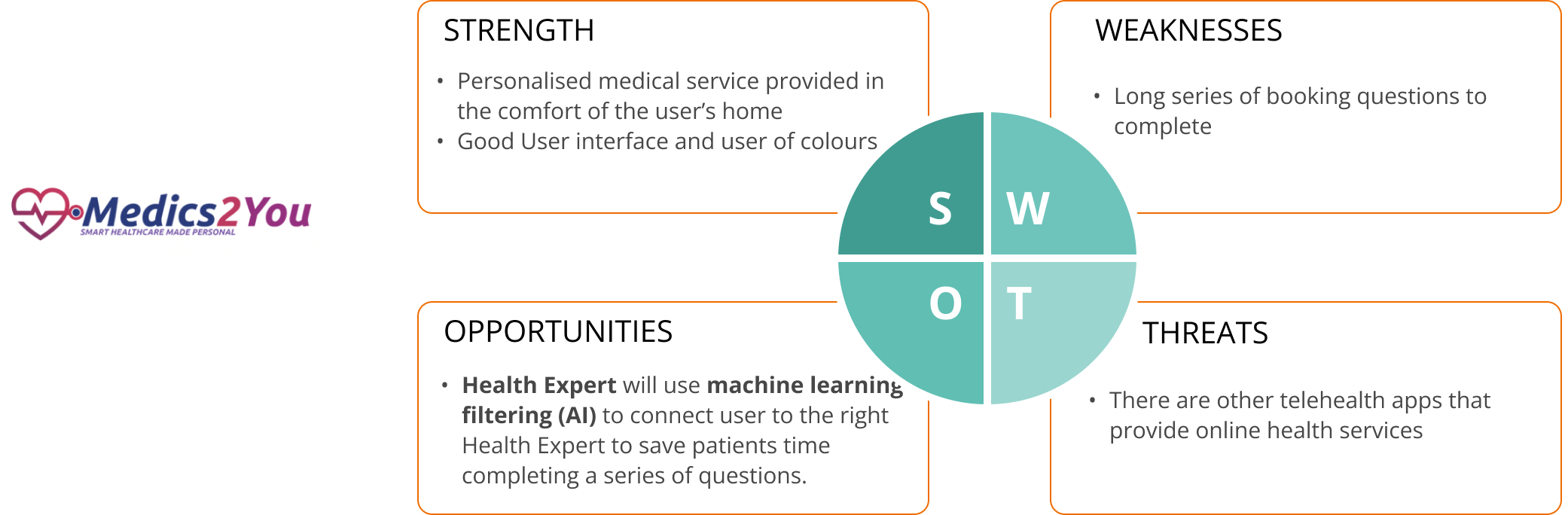
Before doing user research or ideation, I carried out competitive analysis of two health expert apps to understand their strengths, weaknesses and identify opportunities that I could use for my product in the marketplace.
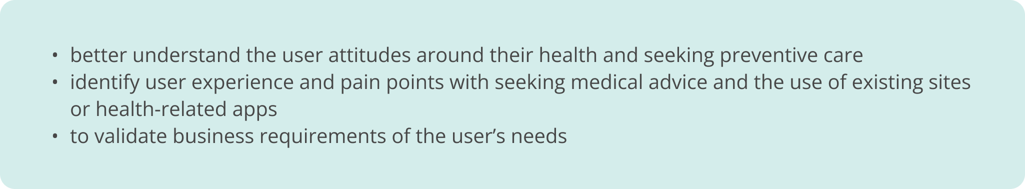
Interviews
I interviewed 3 users through in-person and remote interviews. The use of open-ended questions was key. The goal was to;
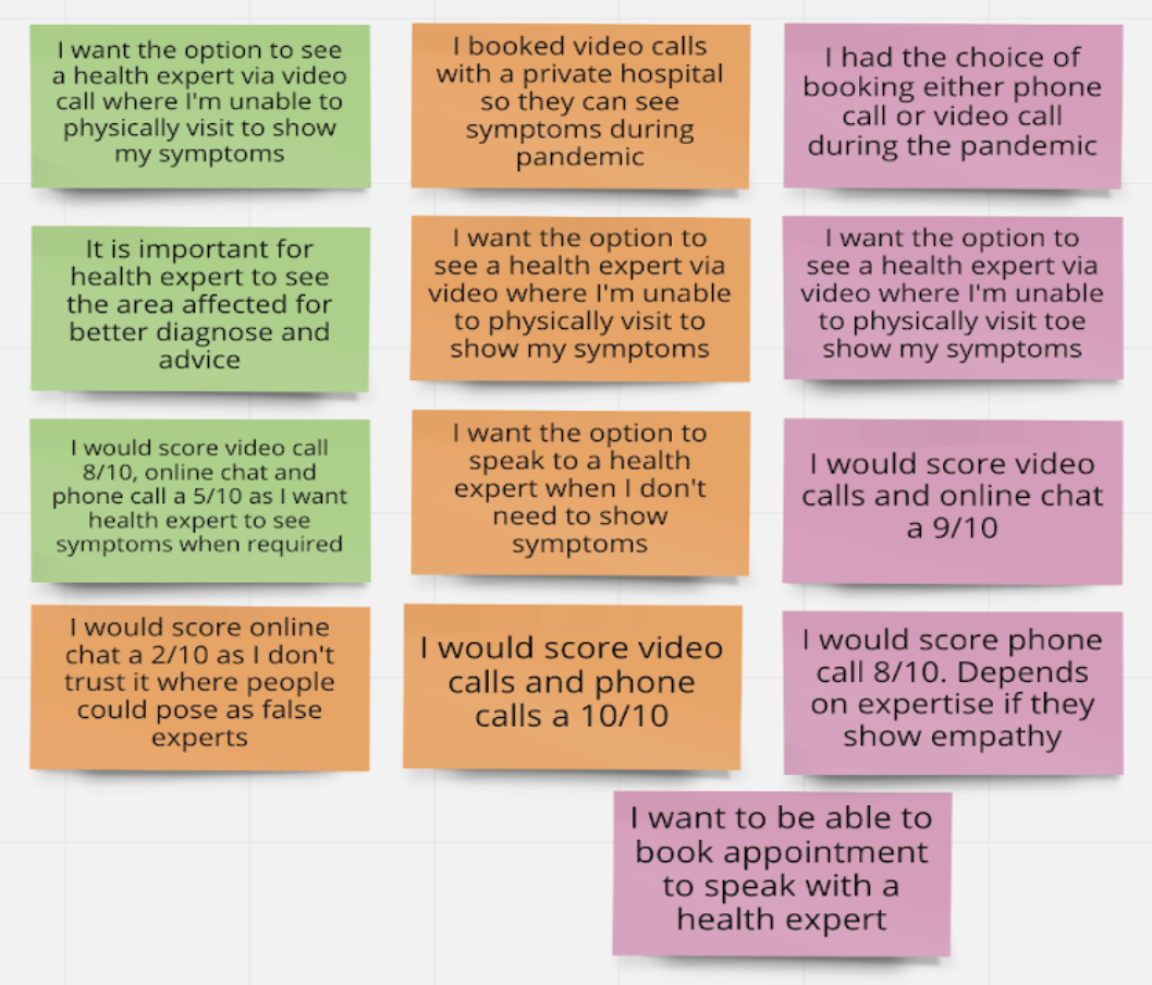
Affinity Map
I did some affinity mapping to visually organise what I learnt. This was a fun activity!
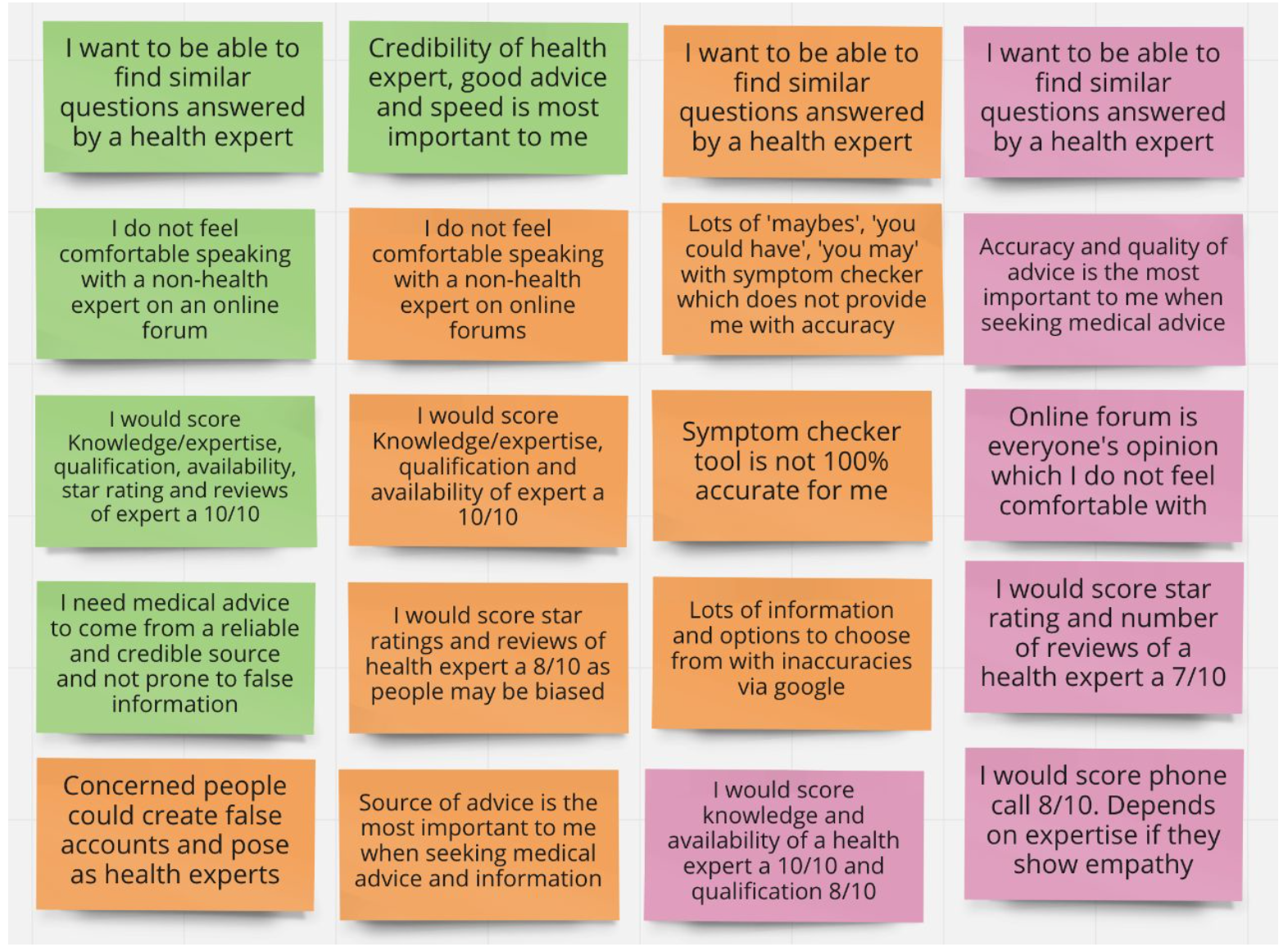
Key findings and insights
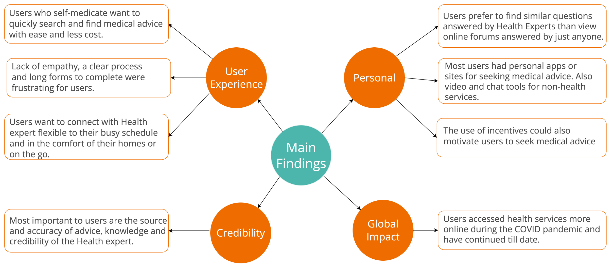


The findings from the affinity mapping helped me establish the personas, Jane and John.

Journey Maps
To better understand Jane and John’s thought process and emotions I created journey maps with a task analysis. This also helped to identify points of friction and opportunities.
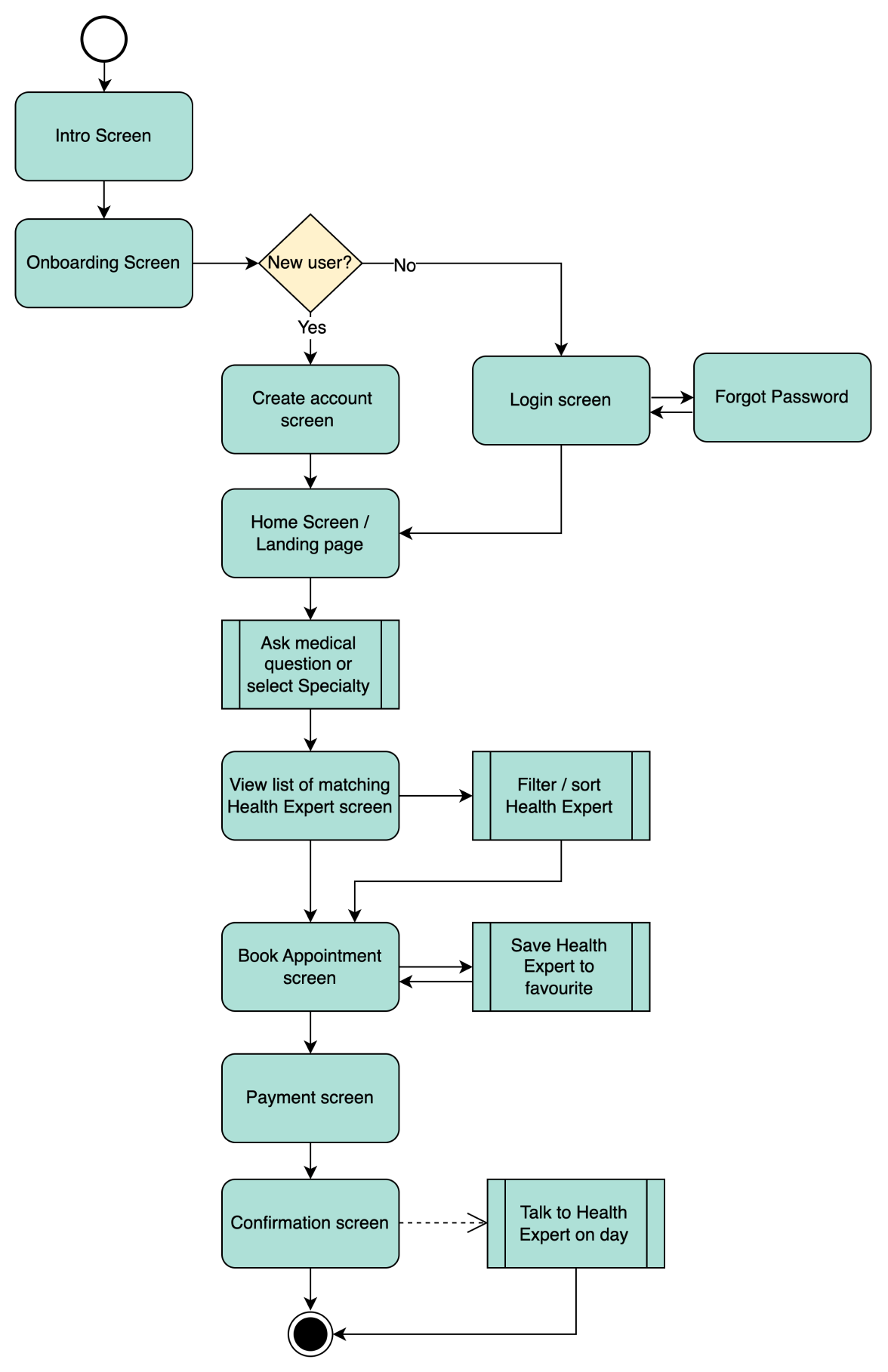
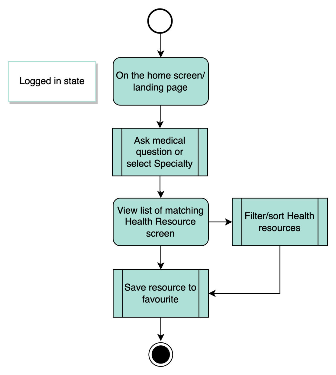
User Flows
The users flows helped me to determine how I could design the interactions for the app.
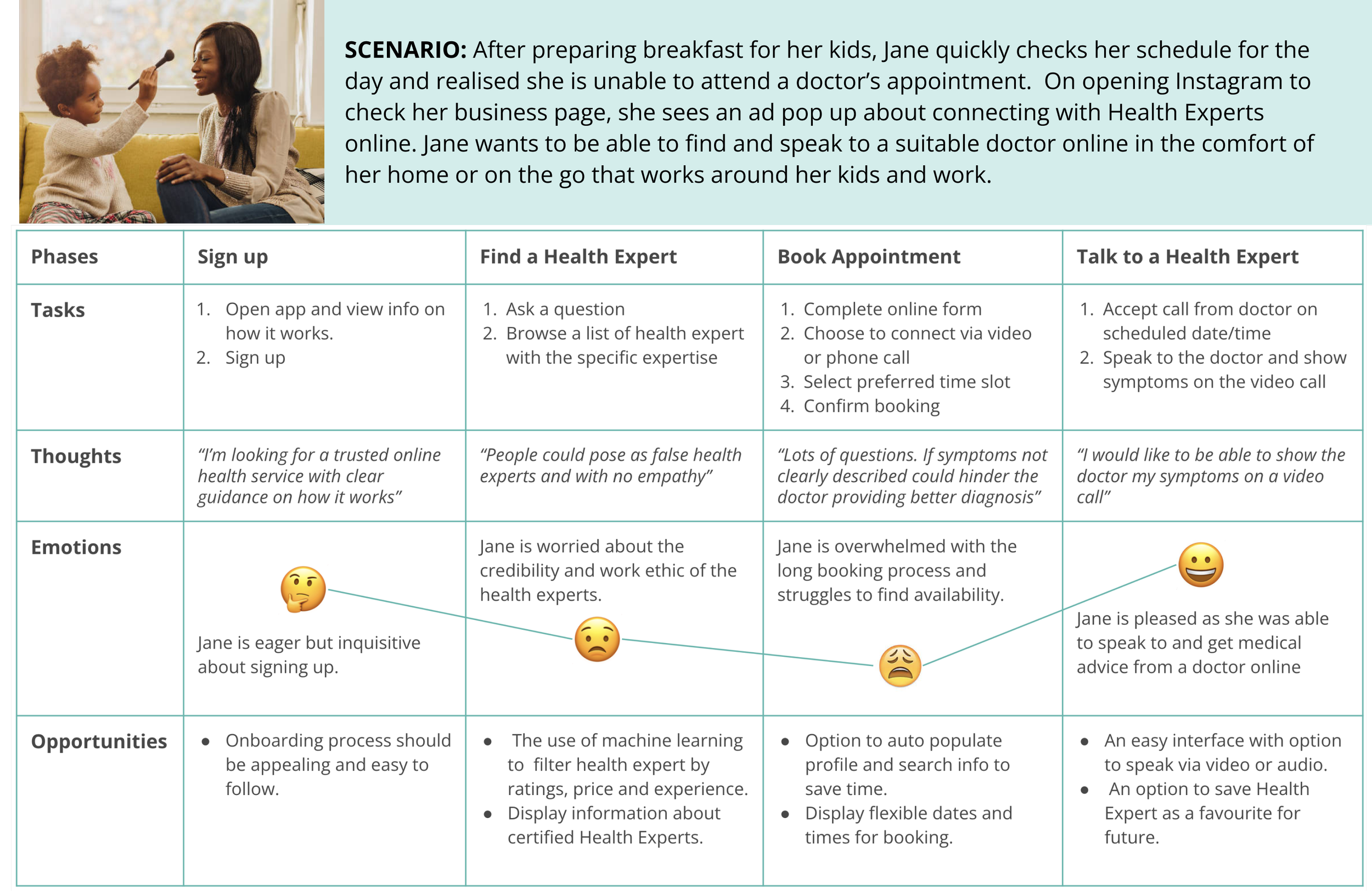
Jane, the busy working mum
USER STORY: As a busy working mum of two, I want to quickly sign up and book a call to speak to a suitable health expert so I can get the right medical advice in the comfort of my home or on the go.
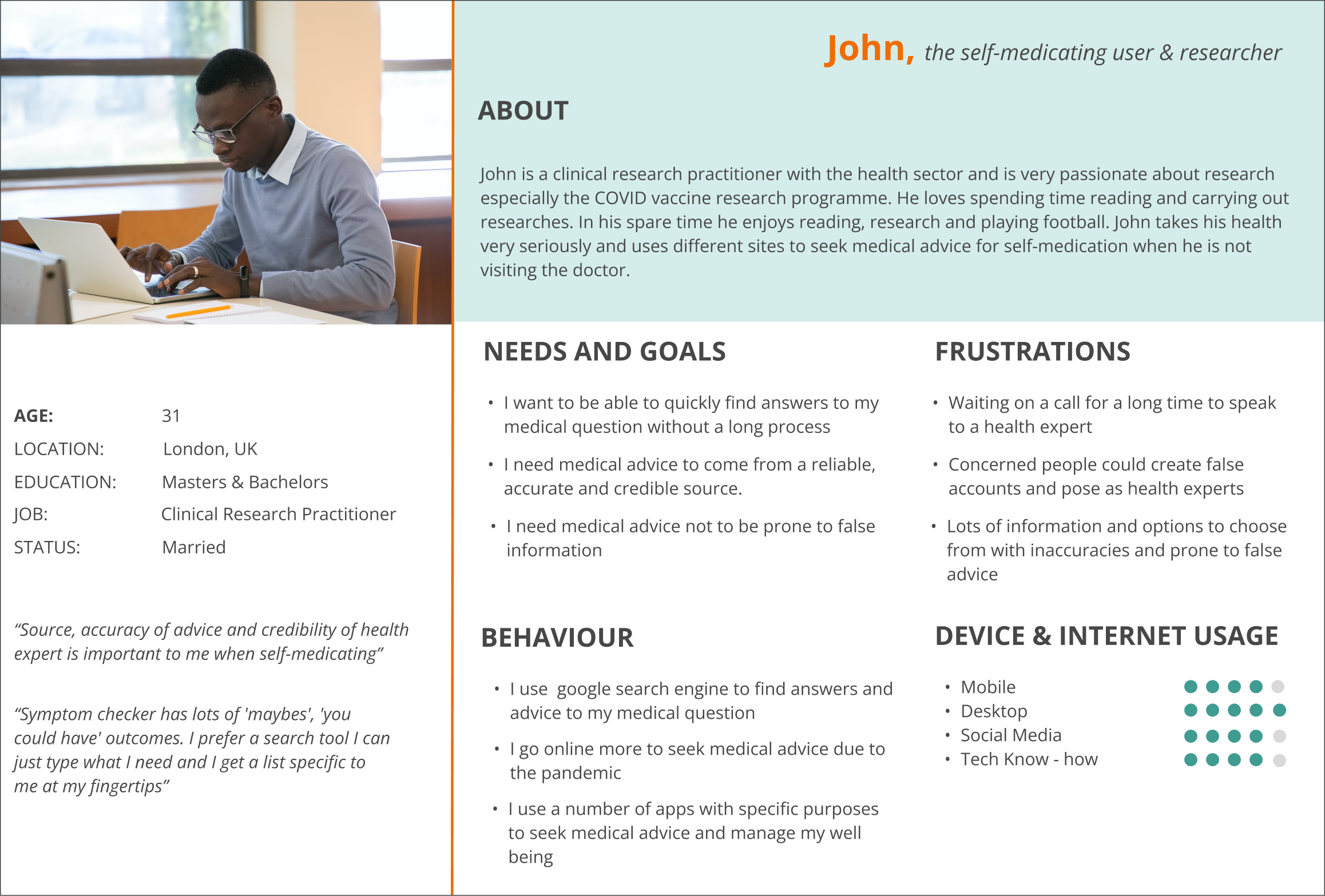
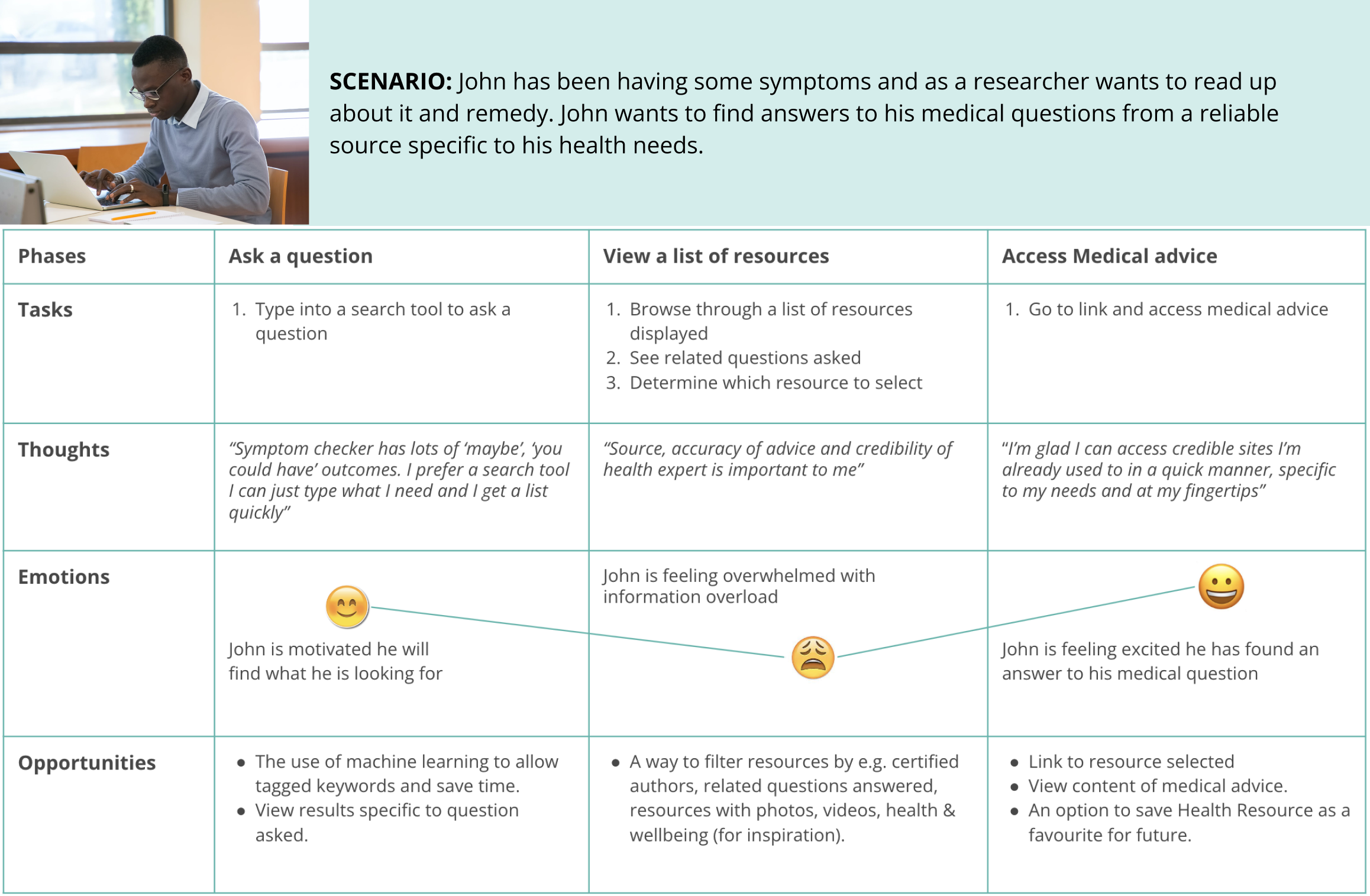
John, the self-medicating user & researcher

USER STORY: As a self-medicating user and researcher, I want to quickly find answers to my medical question from a reliable source specific to my health needs so I can know more about my illness and remedies for cure.
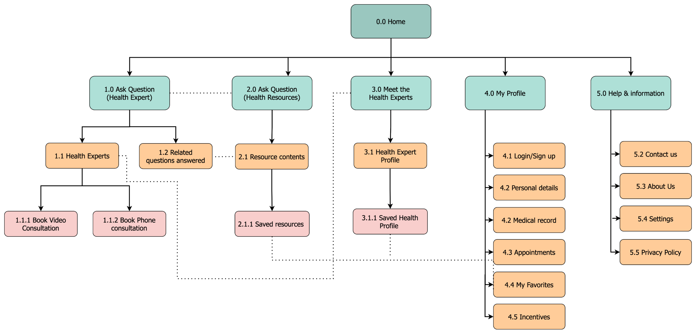
I created a site map to structure the information architecture based on my assumptions from research.
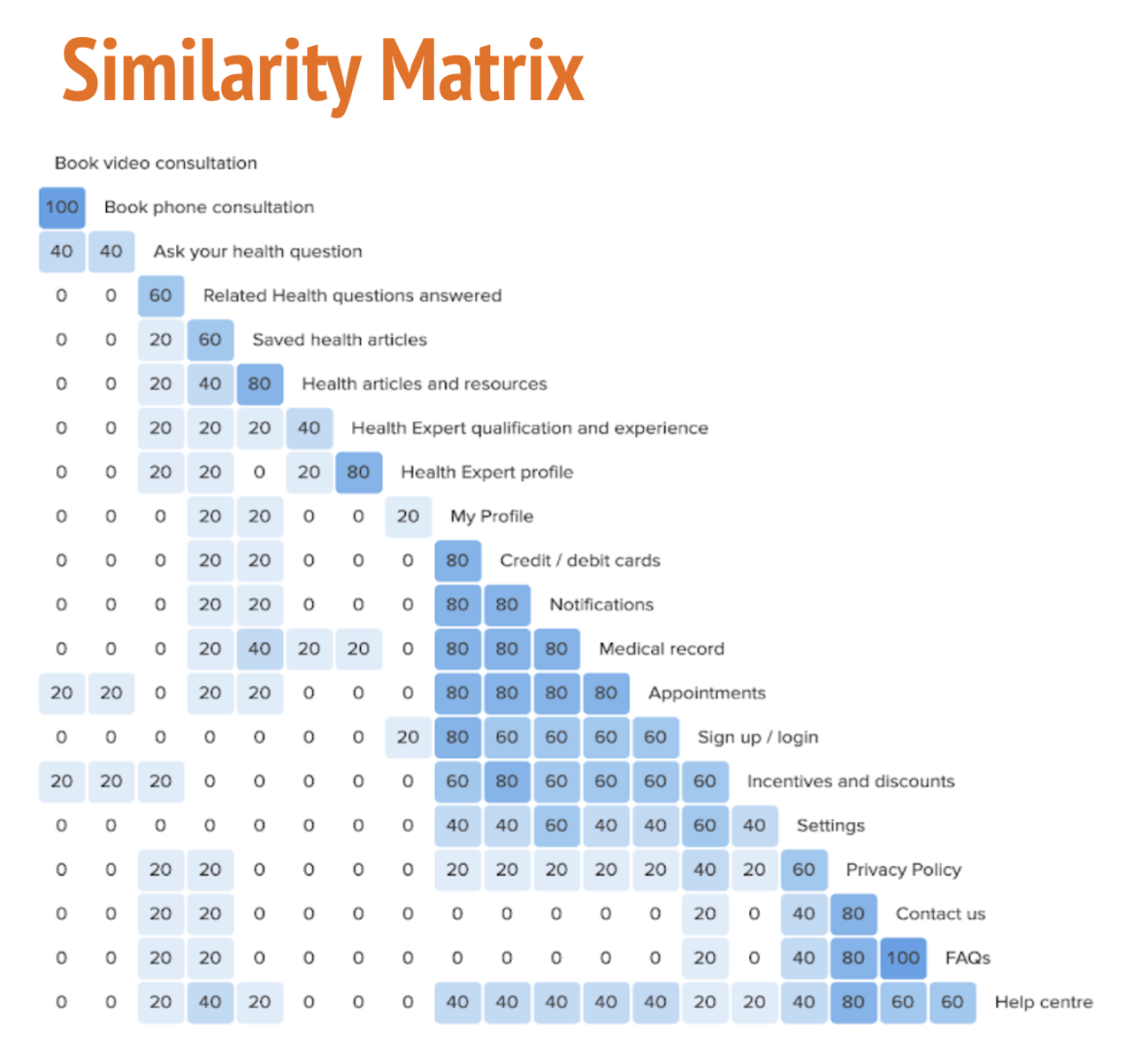
The site map was refined to reflect my findings from the card sorting activity.
I then tested my findings by having participants complete a card sorting activity and displayed a similarity matrix.

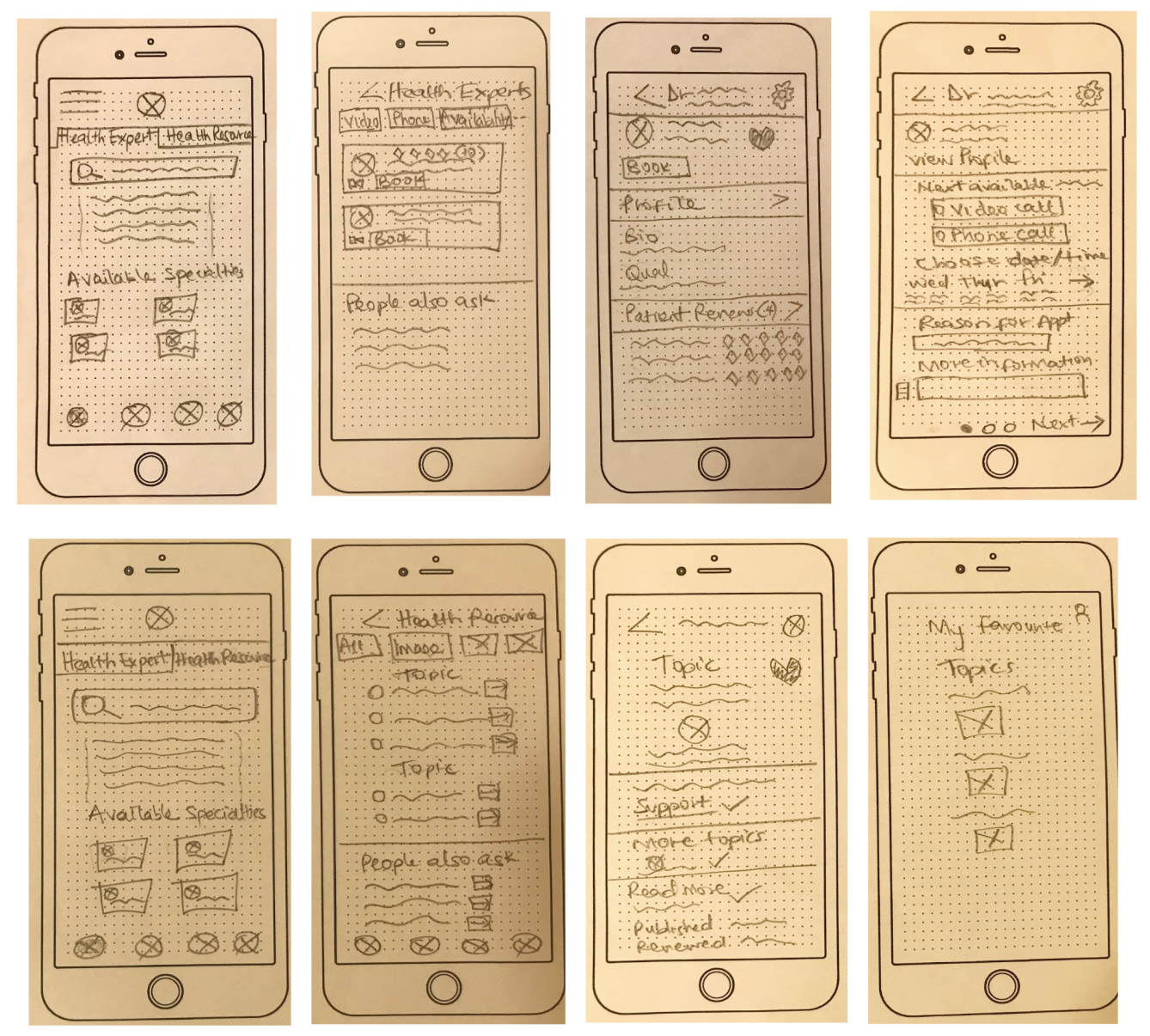
In order to determine how each screen would work, I sketched my initial ideas down and iterated on different options until I decided on a final idea.
Low Fidelity Wireframes
Mid Fidelity Wireframes
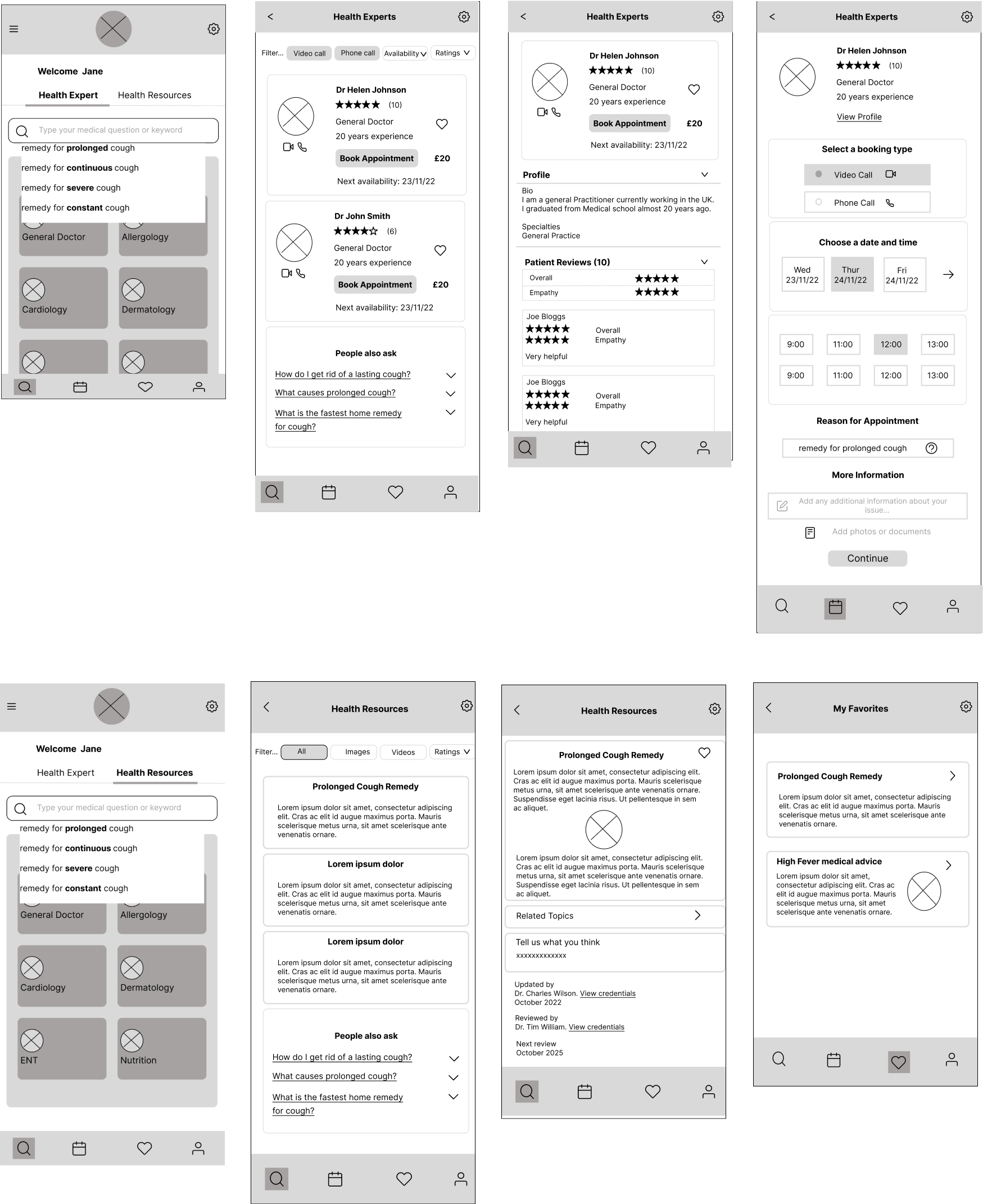

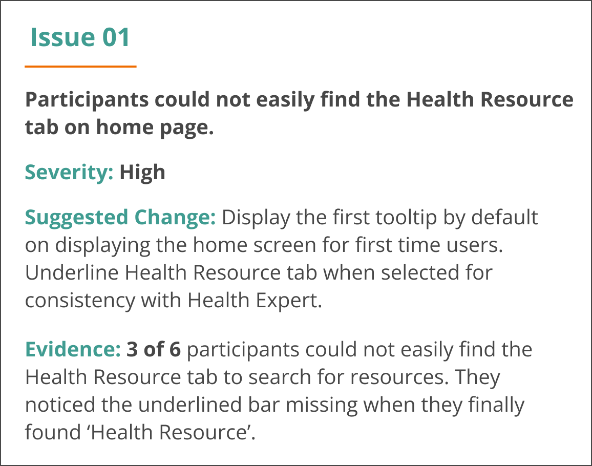
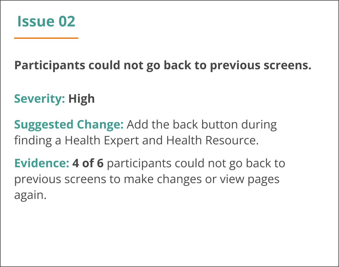
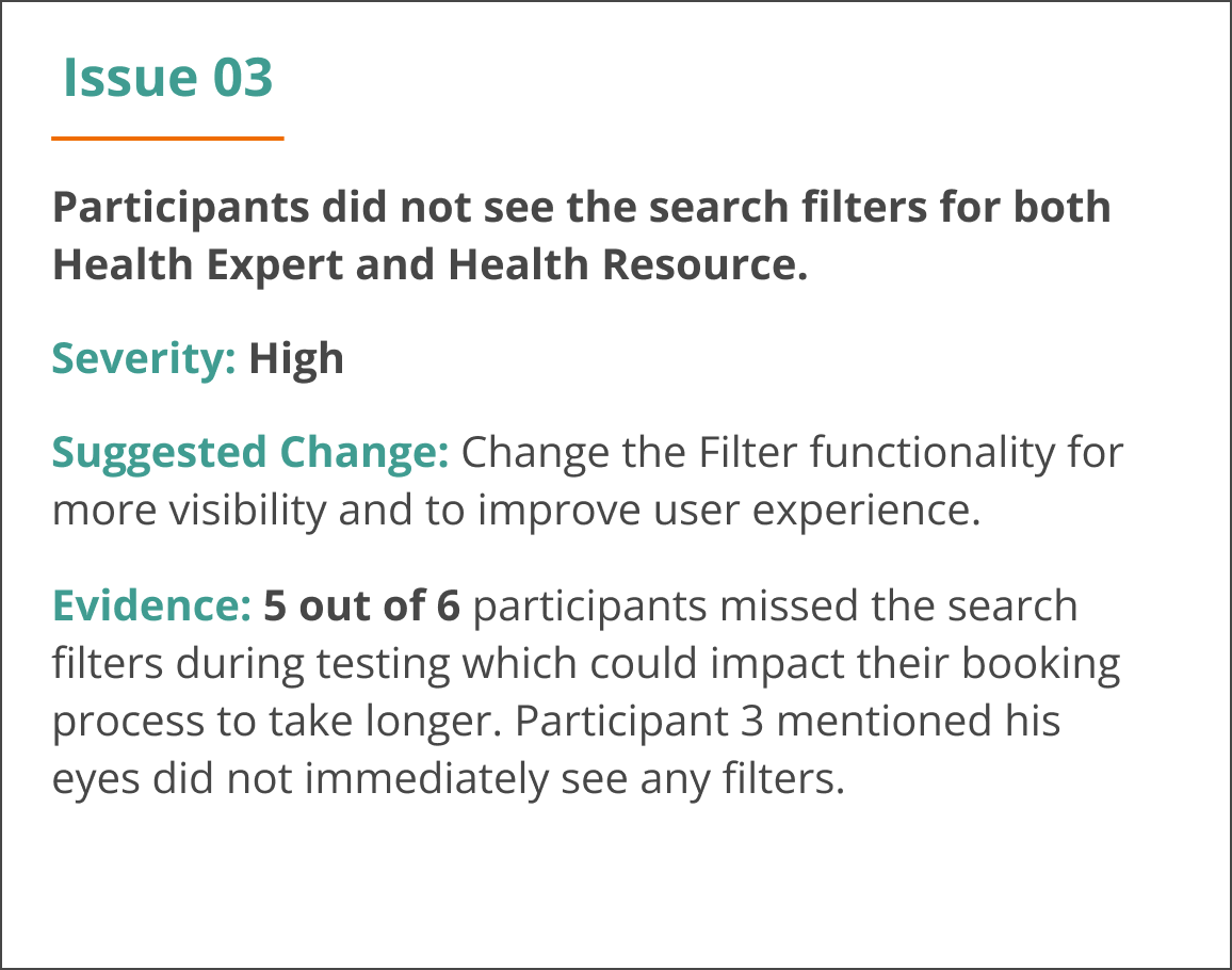
I conducted usability testing with 6 participants and carried out user testing analysis.
Below are the top five priorities issues found after the first round of user testing (based on Jakob Nielsen’s severity ratings).

High Fidelity Prototype
It was time to breathe life into the app with colour and UI elements.
Changes were made based on; user testing, preference testing, peer feedback and accessibility guidelines.
-
![]()
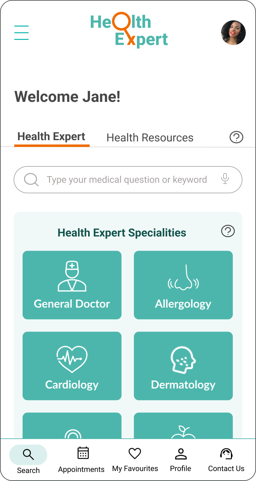
Home Page
A user can easily ask a medical question or select a specialty.
-
![]()
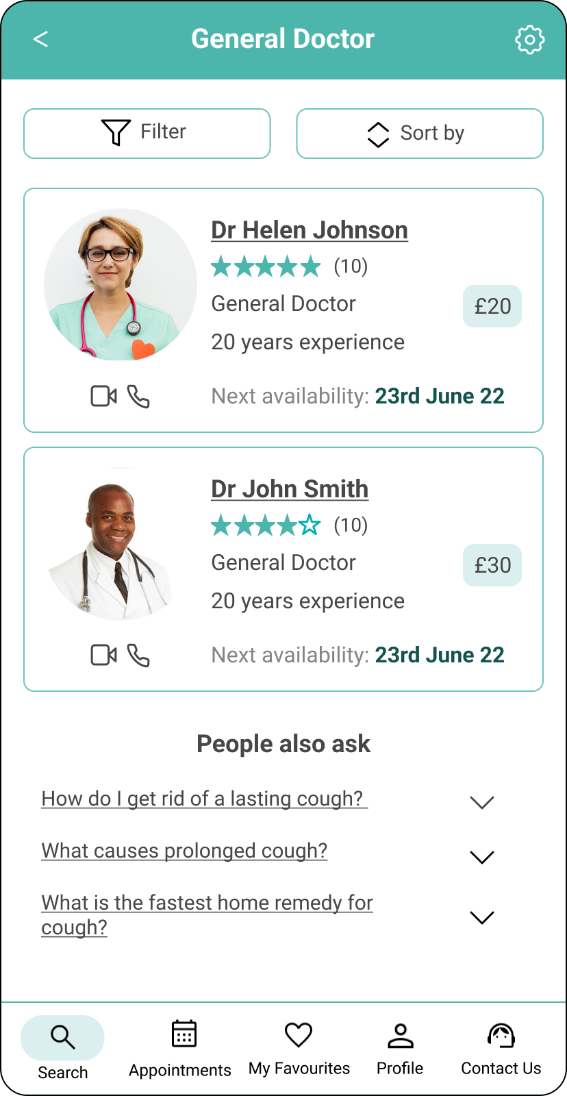
Health Expert List
A user can view and filter list of matching Health Expert with the help of Artificial Intelligence (AI).
This is based on key findings that users want to be able to quickly find a suitable Health expert without filling a long form.
-
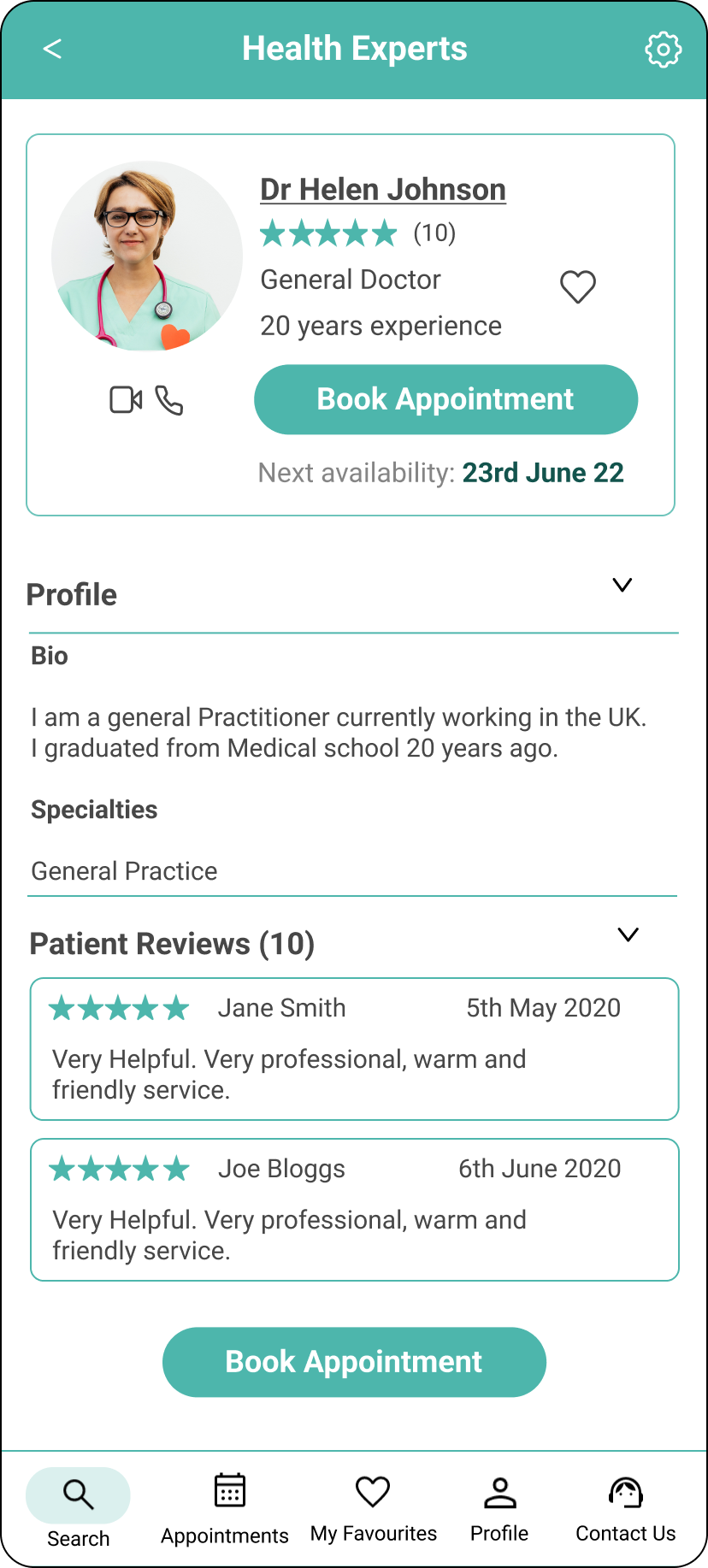
![]()
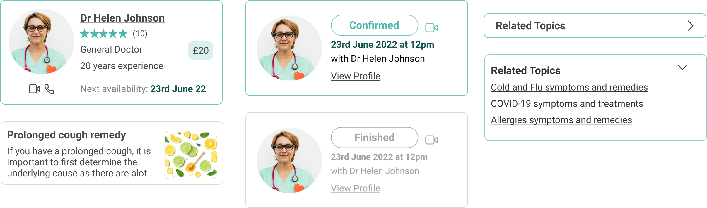
Health Expert
A user can can view information about a certified Health Expert and their credibility.
This is based on key findings that knowledge, credibility and empathy of Health Experts are important factors. In addition users can see ratings from other users to show Health Experts who are empathetic.
-
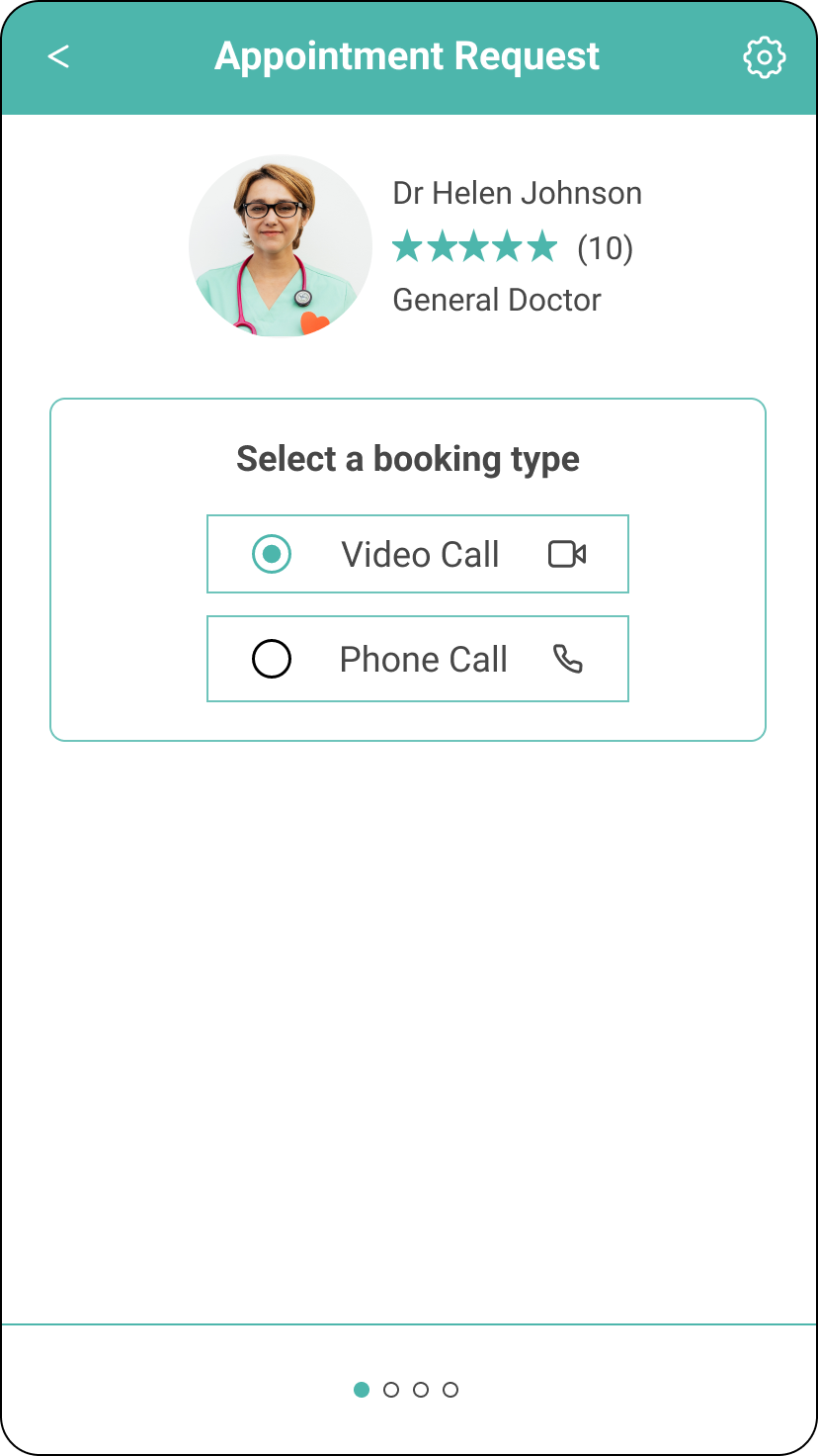
![]()
Book Appointment
A user can choose to book appointment via video call or phone call.
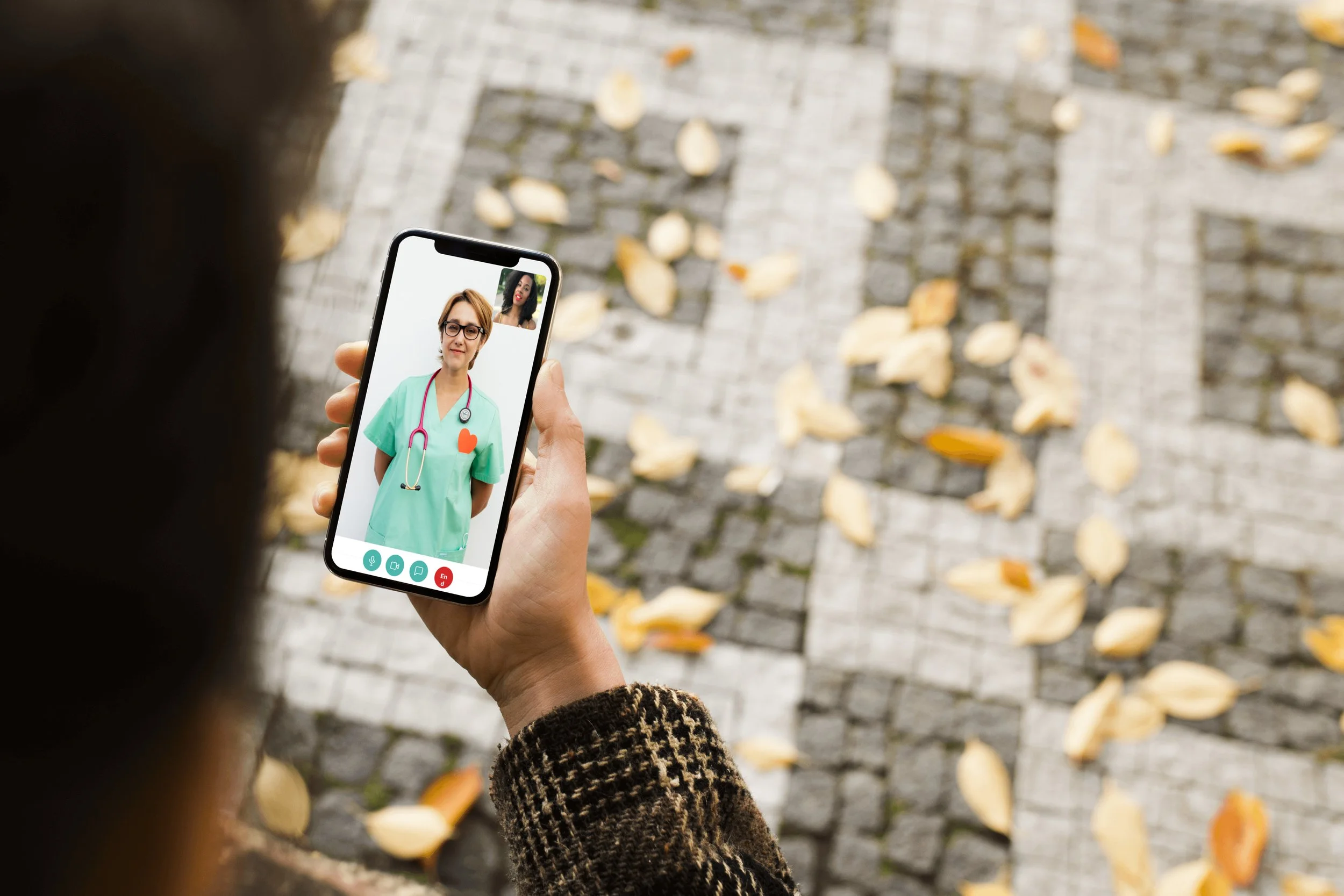
This is based on findings that users spoke to Health Experts mostly online during COVID pandemic. Also users can show physical symptoms on video call.
-
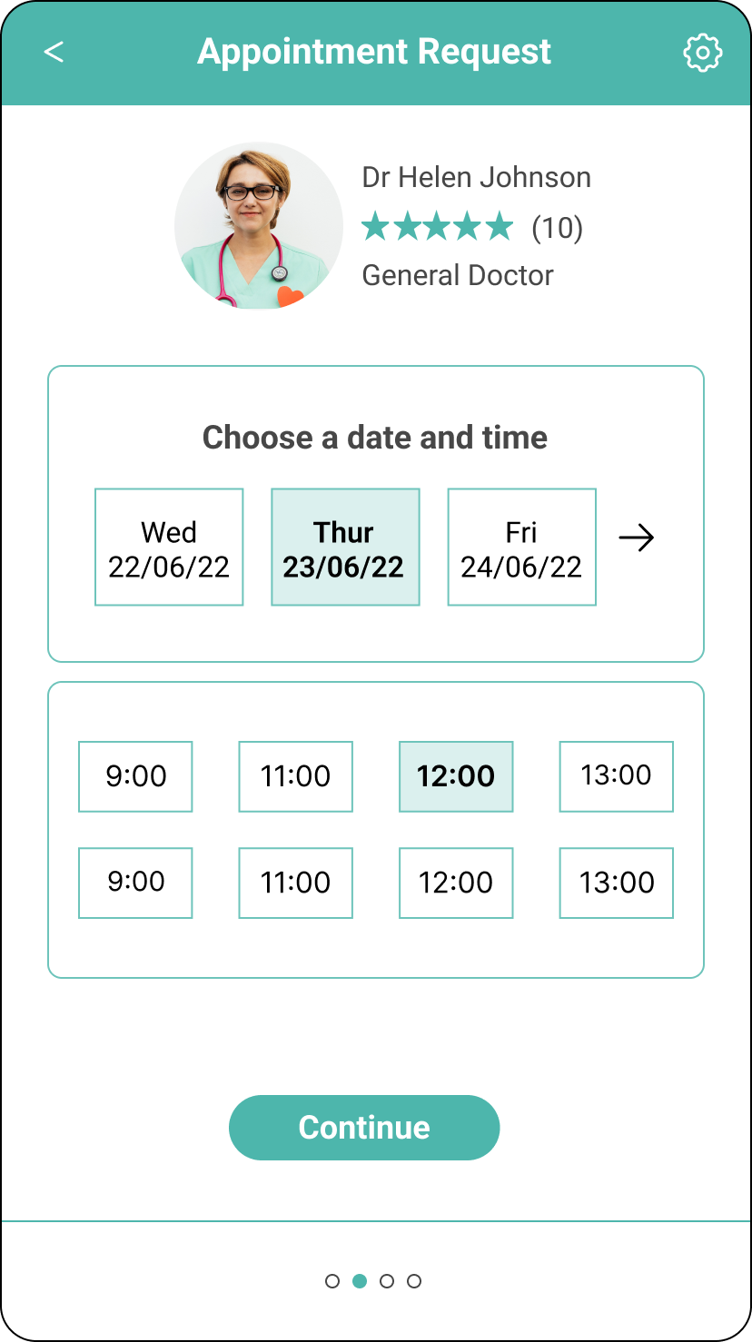
![]()
Book Appointment
A user can choose flexible dates and times suitable to their needs.
This is based on findings that users want to book appointments flexible to their busy schedules.
-
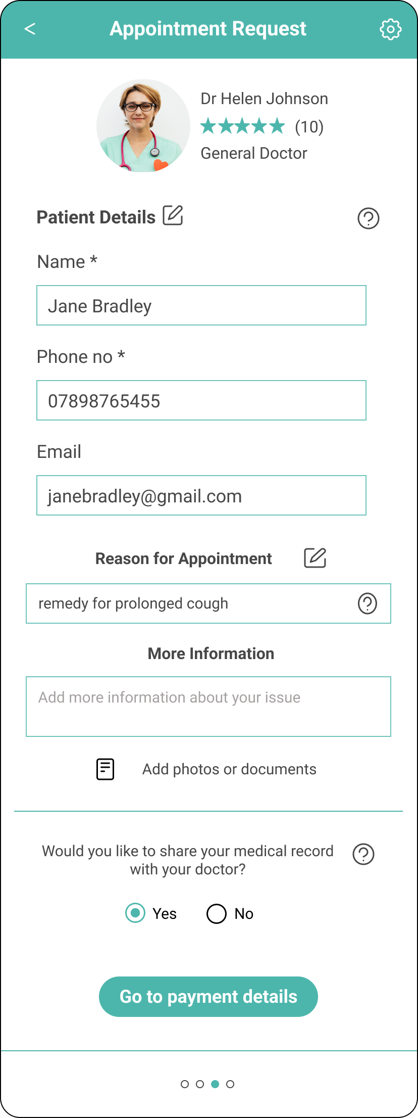
![]()
Patient Details
The user’s details are auto populated to save time and they have the option to amend their details.
-
![]()
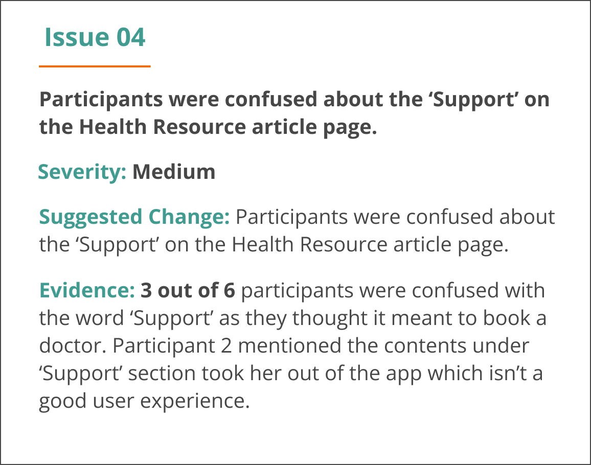
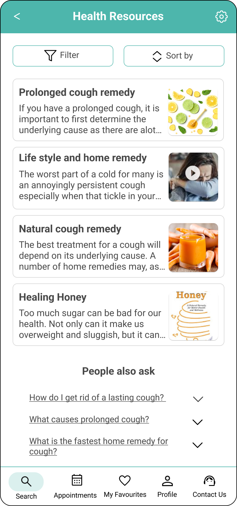
Health Resource List
A user can view and filter list of matching Health resources / articles with the help of Artificial Intelligence (AI).
This is based on key findings that users who self-medicate want to quickly find medical advice with ease and less cost.
-
![]()
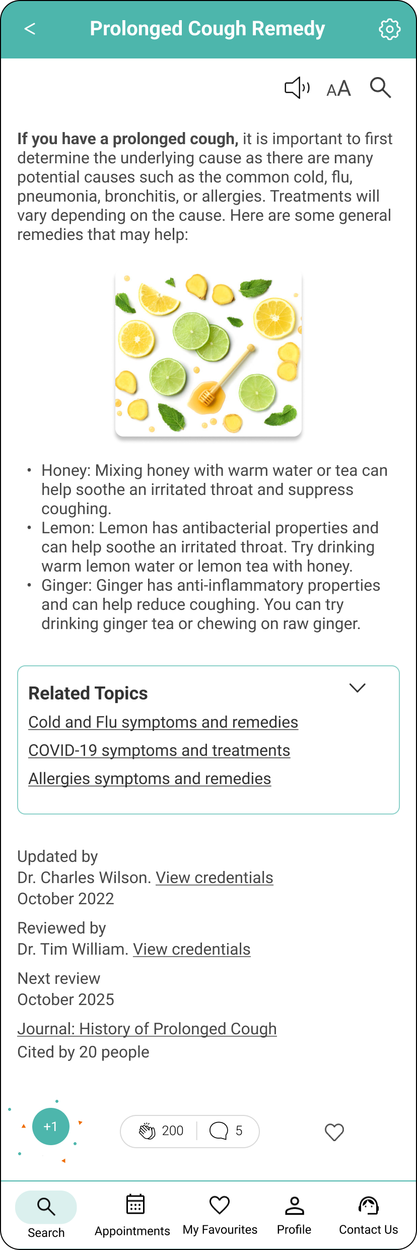
Health Resource
A user can view medical resources with credentials and medical advice from certified Health Experts.
This is based on key findings that source, accuracy of advice, knowledge and credibility of Health Experts are important factors.
-
![]()
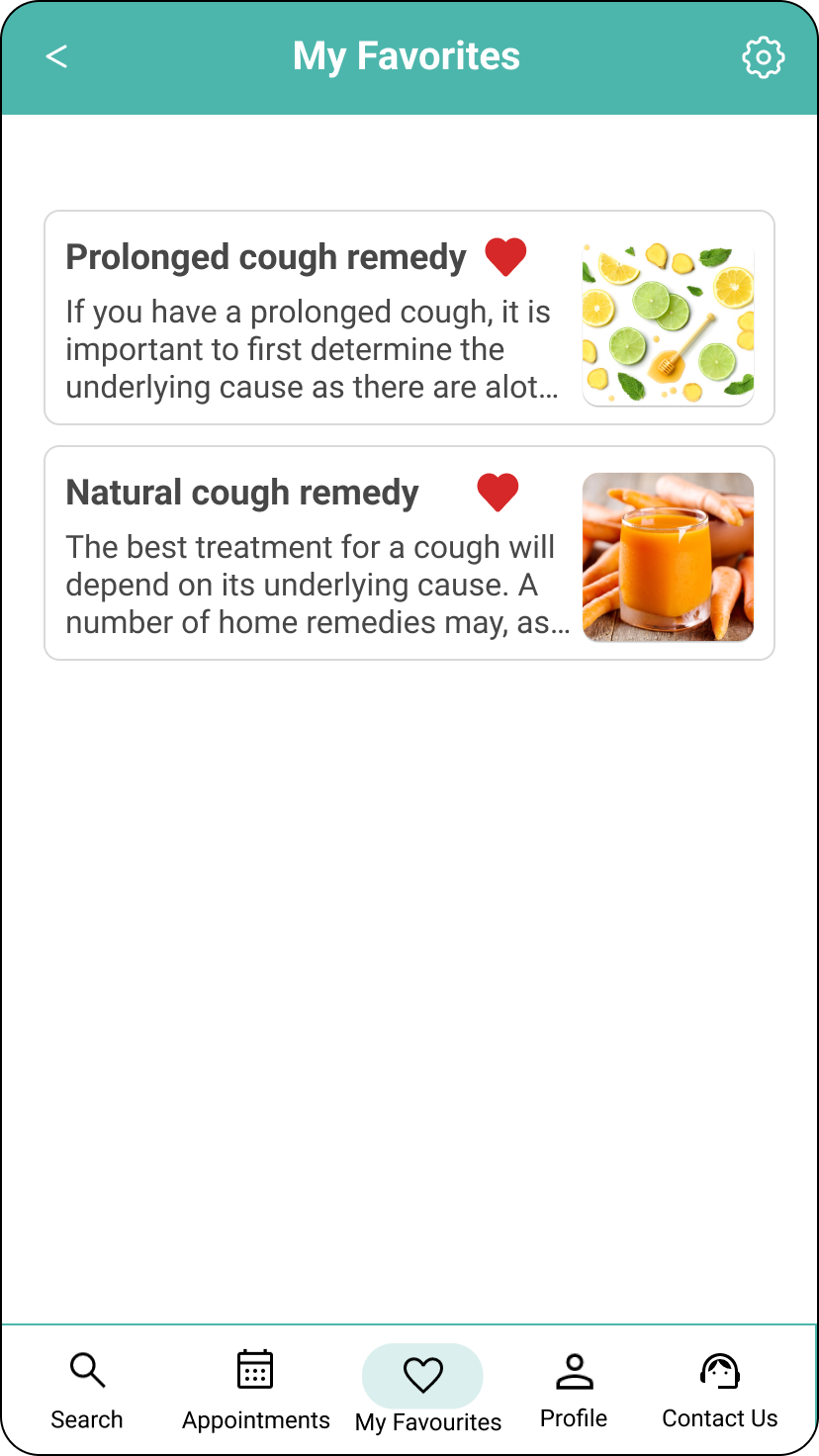
My Favourites
A user can add an article to their favourites.
Design Language System
Health Expert App language communicates reliability and credibility, instilling a feeling of trust and confidence in the information and advice received. This is achieved by using Health Expert ratings, user reviews/feedback, and information on updated Health resources and citations.
Logo size and spacing
The logo is designed in a way that displays a search icon merged with ‘X’ in the word ‘Expert’. The user is able to recognise the name of the App.
The logo should not be closer to the top or edge of anything than 24px.
Minimum size: Heigh: 80px, Width: 180px, Text Roboto #4DB6AC / #EF6C00
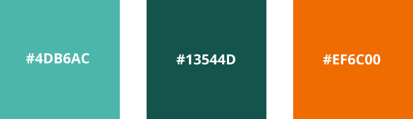
Colour Palette
I made sure to do a design language system that unified the App and I chose these main primary colours to reflect the brand as a Health Expert App.
Teal green as it represents health, tranquility and trust.
Orange represents warmth and enthusiasm.
Primary Colours
Secondary Colours

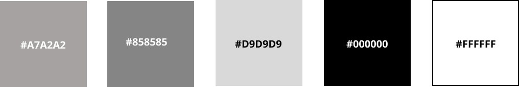
Neutral Colours
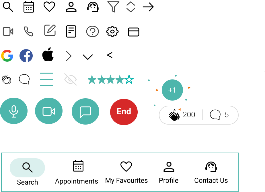
Icons
Outlined and filled icons
The bottom navigation should always have icons outlined, except selected.
Cards
Also knowns as containers are used to group items. Corners have a radius of 8pt
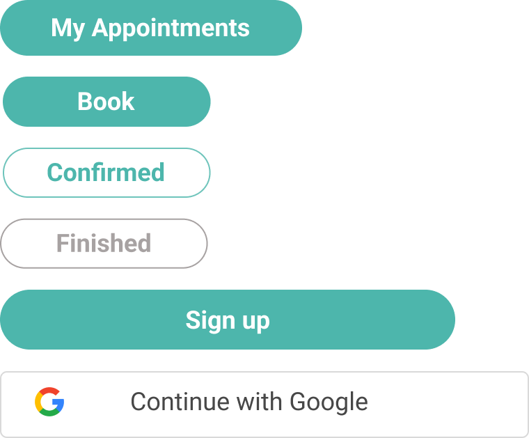
Buttons
Buttons can be either filled or outlined. Regardless of width, corners are always rounded and texts are centred.

I’m excited to see how this project continues to develop overtime. Through this process I’ve been able to strength my skills of being adaptable, flexible and decisive.
What’s Next?
Health Expert app has many more iterations to go through, this is just the minimum viable product which goes over the basic features and functions. In future conduct more user interviews and do more research about how to make the app more personalised for the user. For example, on the home screen when the user login, they can see their upcoming bookings, recommended health resources based on their searches, most popular specialities, etc.